2
$\begingroup$

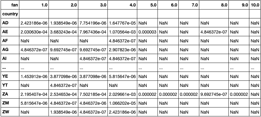
I have a data frame like below:-

Here I have 194 countries and the columns are fan_out values which is in percent of the total population.

Like for country AD, the total fan_out value is 2.24 -06 % of the total population.

enter image description here

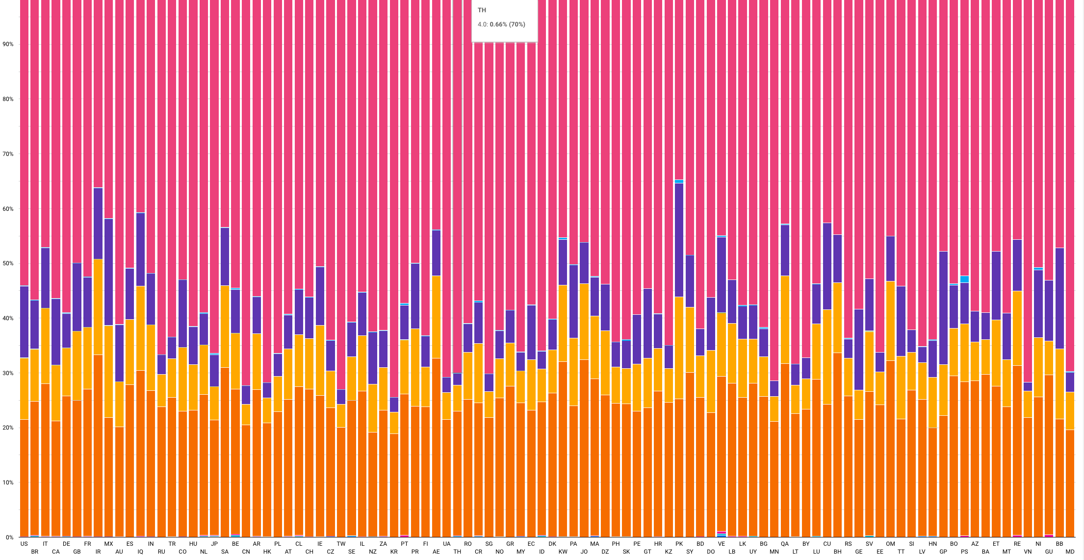
I tried a stacked chart like below:-

The only issue is it's not presentable because the fan_out value for 5,6 or 7 is very small are not clearly seen.

Is there any way I can build a cluster to make sense of this that?

My only question is how to represent this data in one graph to make more sense like finding clusters or a pattern or even I can apply any ML algorithm to find any pattern.

enter image description here

$\endgroup$

1 Answer 1

2
$\begingroup$

You can use a dimensional reduction algorithm like t-SNE: https://youtu.be/wvsE8jm1GzE

https://scikit-learn.org/stable/modules/generated/sklearn.manifold.TSNE.html

It is quite easy to implement and you will see correlations between countries clearly.

$\endgroup$
2
  • $\begingroup$ Thanks Nicolas! I will look into it! $\endgroup$
    – abhi
    Commented Jun 25, 2021 at 18:16
  • $\begingroup$ Can you please provide any examples! 194 countries a lot! $\endgroup$
    – abhi
    Commented Jul 6, 2021 at 4:01

Your Answer

By clicking “Post Your Answer”, you agree to our terms of service and acknowledge you have read our privacy policy.

Not the answer you're looking for? Browse other questions tagged or ask your own question.