7
$\begingroup$

I have a vector and want to detect outliers in it.

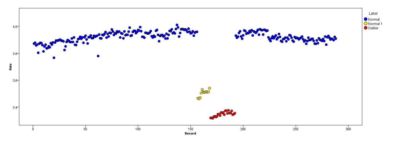
The following figure shows the distribution of the vector. Red points are outliers. Blue points are normal points. Yellow points are also normal.

I need an outlier detection method (a non-parametric method) which can just detect red points as outliers. I tested some methods like IQR, standard deviation but they detect yellow points as outliers too.

I know it is hard to detect just the red point but I think there should be a way (even combination of methods) to solve this problem.

enter image description here

Points are readings of a sensor for a day. But the values of the sensor change because of system reconfiguration (the environment is not static). The times of the reconfigurations are unknown. Blue points are for the period before reconfiguration. Yellow points are for after the reconfiguration which causes deviation in the distribution of the readings (but are normal). Red points are results of illegal modifying of the yellow points. In other words, they are anomalies which should be detected.

I'm wondering whether the Kernel smoothing function estimate ('pdf','survivor','cdf',etc.) could help or not. Would anyone help about their main functionality (or other smoothing methods) and justification to use in a context for solving a problem?

$\endgroup$
8
  • 3
    $\begingroup$ What makes these outliers and not the yellow ones? Do you have examples of outliers or did you just get a set? Does it look similar to this one? How many dimensions? $\endgroup$ Commented Apr 19, 2017 at 11:28
  • $\begingroup$ Thanks. Points are readings of a sensor for a day. But values of the sensor change because of system reconfigurations (the environment is not static). Blue points are for the period before reconfiguration. Yellow points are for after reconfiguration which causes deviation in the distribution of the readings (but are normal). Red points are results of illegal modifying yellow points. It is one dimension. $\endgroup$
    – Arkan
    Commented Apr 19, 2017 at 12:27
  • 1
    $\begingroup$ How often do these reconfigurations happen? Do these red points always happen? You could look at some time series smoothing methods. $\endgroup$ Commented Apr 19, 2017 at 13:24
  • $\begingroup$ It is dynamic and nothing is definite. No. Red points are anomalies created by illegal modifications and don't happen always. Would I ask you to name some well-known methods (smoothing methods)? What is their main functionality? $\endgroup$
    – Arkan
    Commented Apr 19, 2017 at 13:33
  • $\begingroup$ When you search for level shifts you can find changes in the intercept. Post your data See paper by Balke Detecting Level Shifts in Time Series Nathan S. Balke Journal of Business & Economic Statistics Vol. 11, No. 1 (Jan., 1993), pp. 81-92 $\endgroup$
    – Tom Reilly
    Commented Apr 19, 2017 at 14:30

3 Answers 3

4
$\begingroup$

You may view your data as a time series where an ordinary measurement produce a value very close to the previous value and a re-calibration produce a value with a large difference to the predecessor.

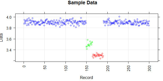
Here are simulated sample data based on normal distribution with three different means similar to your example. enter image description here

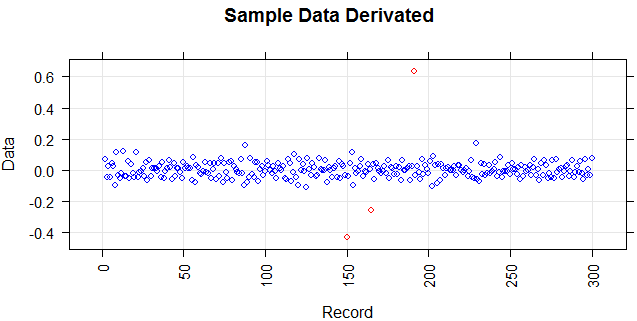
By calculating the difference to the previous value (a sort of derivation) you get the following data:

enter image description here

My interpretation of your description is, that you tolerates re-calibration (i.e. points on greater distance from zero, red in the diagram), but they must interchange between positive and negative values (i.e. corresponding to shift from blue state to the yellow one and back).

This means you can set up an alarm seeing a second one red point either on the negative or positive side.

$\endgroup$
5
  • $\begingroup$ I really appreciate your response. Yes, we can say it is like re-calibration and this is a good analogy. Your approach is good. I tested it. The result is exactly like the one you drew. The first red point is the first point of yellow points. The second point is the first point of the red points. The third red point is the last point of red points. Therefore, it is hard to discover knowledge from this data. This is because we couldn't discuss the red points after the first red point. We may need to visualize the primary data to conclude but this is human intervention. $\endgroup$
    – Arkan
    Commented Apr 20, 2017 at 20:38
  • $\begingroup$ @Marmite Bomber It would be nice if you share the snippet of codes to catch the idea from a programming point of view. $\endgroup$
    – Mario
    Commented Jun 20, 2019 at 17:07
  • $\begingroup$ @Mario good idea - let me see if I can find it after more than two years;) $\endgroup$ Commented Jun 20, 2019 at 17:53
  • $\begingroup$ @Mario see my other answer;) $\endgroup$ Commented Oct 19, 2019 at 8:09
  • $\begingroup$ @MarmiteBomber thanks for the feedback but man I was interested in Python code! $\endgroup$
    – Mario
    Commented Oct 25, 2019 at 13:30
0
$\begingroup$

If you use logging you can use a running average that resets if the configuration changes. However, this will have the weakness that you need at least some data before you can detect such an outlier.

Your data looks rather "nice" (not too much noise). I would recommend taking the average over the last 10-20 points in the same configuration. If these values are some kind of counted quantity you can take a poisson error for individual data points and calculate the error on the average.

How much historical data do you have? If you have a lot you can use it to fine tune your alarm rate in a way that you catch an acceptable ratio of all real outliers while getting a minimal number of fake warnings. What is acceptable depends on the specific problem. (Cost of False Positives or not detected outliers and their abundance).

$\endgroup$
5
  • $\begingroup$ Thanks. Unfortunately, the reconfigurations are different and this doesn't let us tune an alarm rate. Can you explain a bit more about averaging recent points? $\endgroup$
    – Arkan
    Commented Apr 19, 2017 at 17:42
  • $\begingroup$ I am under the assumption that these data points are in chronological order- correct? Then you can for every point use the y-axis information (Data in your plot) of the last XX points. Lets say 10 but this obviously depends a bit on how your data looks. For these 10 points you then calculate the average or- better if you have an error estimate on the individual measurements the weighted error. $\endgroup$
    – El Burro
    Commented Apr 19, 2017 at 20:10
  • $\begingroup$ You can still tune the alarm rate because you do not define an alarm as a deviation from a fixed value larger than X but as the deviation from a moving average. $\endgroup$
    – El Burro
    Commented Apr 19, 2017 at 20:17
  • $\begingroup$ Thanks.Yes. They in chronological order. I'm wondering that whether Kernel smoothing function estimate is a help or not. $\endgroup$
    – Arkan
    Commented Apr 19, 2017 at 21:11
  • $\begingroup$ I would suggest starting with a simple moving average that resets for every configuration change and see if it gets the job done. If you do not have the information available when a configuration change occurs based on how this looks by eye I see no other reliable option to seperate yellow from red. At least in the given example it does not look like the shape is very different between both. $\endgroup$
    – El Burro
    Commented Apr 19, 2017 at 21:23
0
$\begingroup$

Lets illustrate the approach proposed in the other answer with an simple example

Get Data

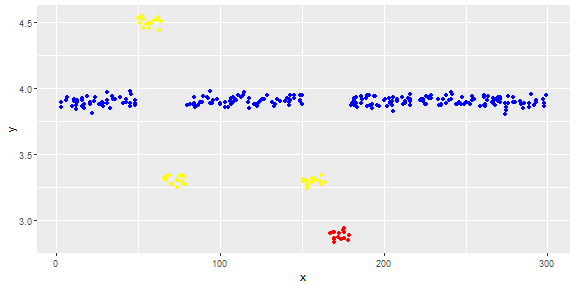
We will simulate tha data with seven chunks produced with normal distribution with different means.

This is important as it allow us to cleanly distinct between the groups and to simple detect the breaking points. This answer use elementary threshold approach, some more advanced way might be required for your real data.

dt <- rbind(
data.frame(color=1, x =  round(runif(50, min = 0, max = 50)), y = rnorm (50,mean=3.9, sd=.03)), 
data.frame(color=2, x =  round(runif(15, min = 50, max = 65)), y = rnorm (15,mean=4.5, sd=.03)),
data.frame(color=2, x =  round(runif(15, min = 65, max = 80)), y = rnorm (15,mean=3.3, sd=.03)),
data.frame(color=1, x =  round(runif(70, min = 80, max = 150)), y = rnorm (70,mean=3.9, sd=.03)), 
data.frame(color=2, x =  round(runif(15, min = 150, max = 165)), y = rnorm (15,mean=3.3, sd=.03)), 
data.frame(color=3, x =  round(runif(15, min = 165, max = 180)), y = rnorm (15,mean=2.9, sd=.03)), 
data.frame(color=1, x =  round(runif(120, min = 180, max = 300)), y = rnorm (120,mean=3.9, sd=.03))
)
dt$color <- as.factor(dt$color)
dt <- as_tibble(dt)

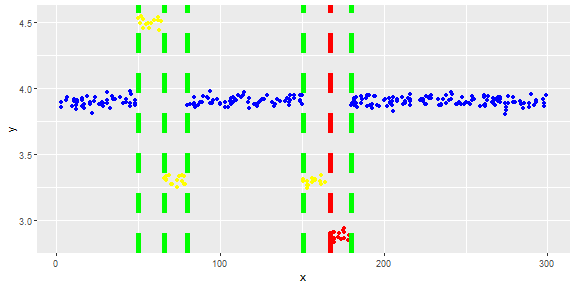
enter image description here

Derive the Breaking Points

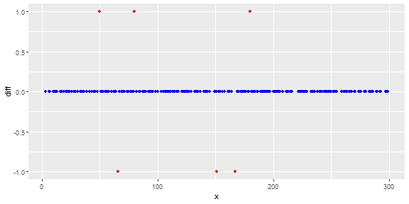
With a simple difference to the preceeding point lag(y) we get the outliers. They are classsified using a threshold.

enter image description here

Change of Behaviour Classification

Base on the rules you described, the breaking points are classified as OK and problem.

The rule states that no two changes in the same direction are allowed. The second move in teh previos direction is considered as a problem.

You may need to adjust this simple interpretation if your logik is more advanced.

## extract outliers and get previous value
dt2 <- filter(dt2, diff != 0) %>%
   mutate(cs = cumsum(diff),
          prev = lag(diff),
          cls = case_when(
                      diff * prev >  0 ~ "problem",
                      TRUE ~ "OK"))
## show 
dt2 %>% select(x,y,diff,prev,cls)                       
## # A tibble: 6 x 5
##       x     y  diff  prev cls    
##   <dbl> <dbl> <dbl> <dbl> <chr>  
## 1    50  4.53     1    NA OK     
## 2    66  3.32    -1     1 OK     
## 3    80  3.87     1    -1 OK     
## 4   151  3.32    -1     1 OK     
## 5   167  2.91    -1    -1 problem
## 6   180  3.87     1    -1 OK

Presentation

Finaly you projects the recognised outliers to the original data

## project in the original data
ggplot(data=dt, mapping = aes(x=x, y=y) )  +
  geom_point(mapping = aes(color = color) )  +
  scale_color_manual(values=c("blue", "yellow", "red","green","red")) +
  theme(legend.position="none") +
  geom_vline(data=dt2, aes(xintercept=x, color=cls),
             linetype="dashed", size = 2)

enter image description here

$\endgroup$

Your Answer

By clicking “Post Your Answer”, you agree to our terms of service and acknowledge you have read our privacy policy.

Not the answer you're looking for? Browse other questions tagged or ask your own question.