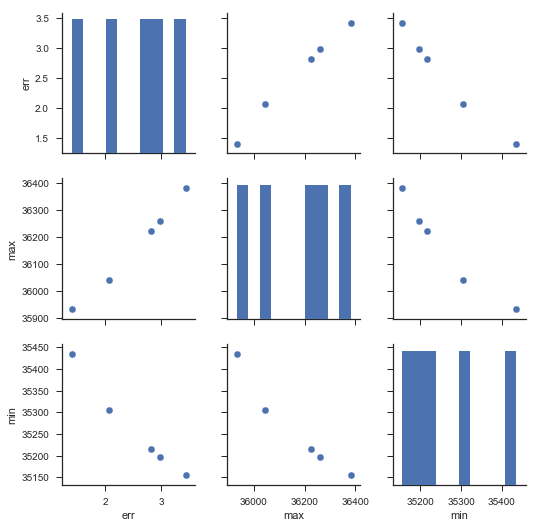
I have the below data, I am looking for a effective visualization or graphical method (in Python) to understand how the err is distributed with respect to min and max.
Data_X_err.head()
Out[137]:
     min    max   err
0  35435  35933  1.40
1  35155  36382  3.43
2  35305  36042  2.07
3  35216  36225  2.82
4  35196  36259  2.98
Thank you.

