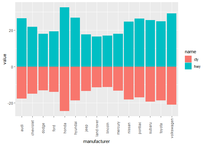
You can either reshape the data into long format (after joining the two datasets) and use geom_col once, or have two geoms as you have in your question. However, the latter needs some variation to have the aes in geom_col and not in ggplot.
Below, I have an example with mpg dataset, illustrating the two options (except the joining). I also included an example with your datasets but since you don't have a reproducible example, I cannot be sure of the outcome.
library(dplyr)
library(ggplot2)
library(tidyr)
## Calling geom_col twice
mpg %>%
  group_by(manufacturer) %>%
  summarise_if(is.numeric, mean) %>%
  select(manufacturer, cty, hwy) %>%
 ggplot() +
  geom_col(aes(x=manufacturer, y=hwy, fill="hwy")) +
  geom_col(aes(x=manufacturer, y=-cty, fill="cty")) +
  theme(axis.text.x = element_text(angle = 90, vjust = 0.4))

## Converting data to long format
mpg %>%
  group_by(manufacturer) %>%
  summarise_if(is.numeric, mean) %>%
  mutate(cty = -cty) %>%
  select(manufacturer, cty, hwy) %>%
  pivot_longer(., -manufacturer) %>%
 ggplot() +
  geom_col(aes(x=manufacturer, y=value, fill=name)) +
  theme(axis.text.x = element_text(angle = 90, vjust = 0.4))

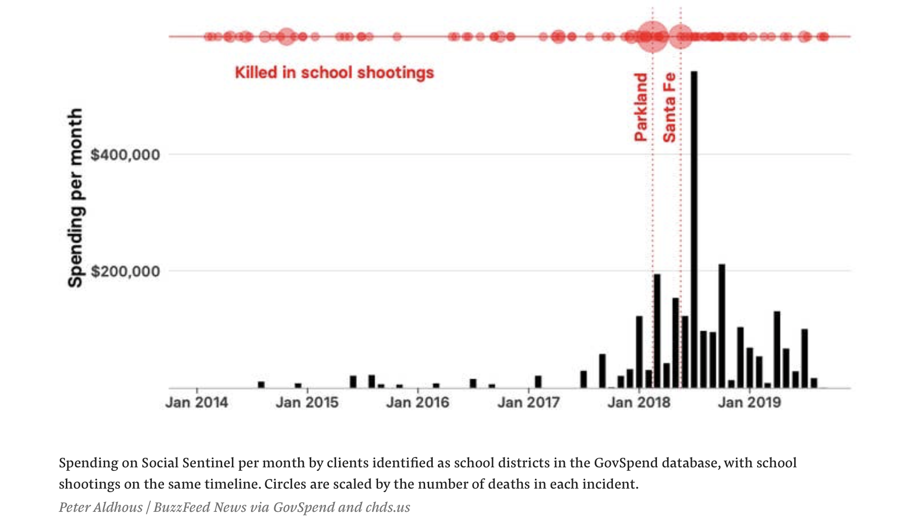
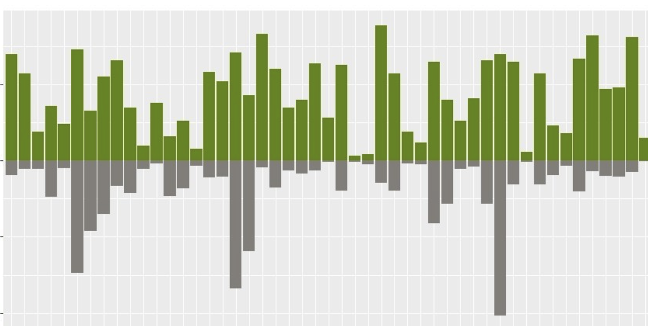
For your datasets, first we join them on date column and then we can use geom_col on each of the desired columns. Note that I have aes in geom_col and not in the ggplot. You need to make sure that your date column is not class of factor (but joining may resolve that issue). If you shared output of dput(head(dataset)) for each of your two datasets, I could further investigate your problem.
recent_school_shootings %>%
  full_join(., school_purchases_month, by = "date", suffix = c("s", "p")) %>%
 ggplot() +
  geom_col(aes(x=date, y=total, fill="Purchase")) +
  geom_col(aes(x=date, y=-killed, fill="Shooting"))
Created on 2020-05-20 by the reprex package (v0.3.0)


dput(head(dataset))on each of your dataframes probably works. $\endgroup$recent_school_shootings$killed=mutate(recent_school_shootings, killed= -killed)change it torecent_school_shootings=mutate(recent_school_shootings, killed= -killed)$\endgroup$