Two things before the answer:
- Please always produce a sample dataframe with
dput()
- As this is totally coding based, this might be more suitable for StackOverflow
Proceeding with the answer
#Load the libraries
library(tidyverse)
library(reshape2)

#Create the data frame

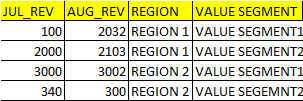
JUL_REV <- c(100,2000,3000,340)
AUG_REV <- c(2032,2103,3002,300)
REGION <- c('REGION 1','REGION 1','REGION 2','REGION 2')
VALUE_SEGMENT <- c('VALUE SEGMENT 1','VALUE SEGMENT 2','VALUE SEGMENT 1','VALUE SEGMENT 2' )

df <- data.frame(JUL_REV, AUG_REV, REGION, VALUE_SEGMENT)

#Melt the dataframe

melt(df, id=c('REGION','VALUE_SEGMENT')) -> melt_df

#Plot with ggplot

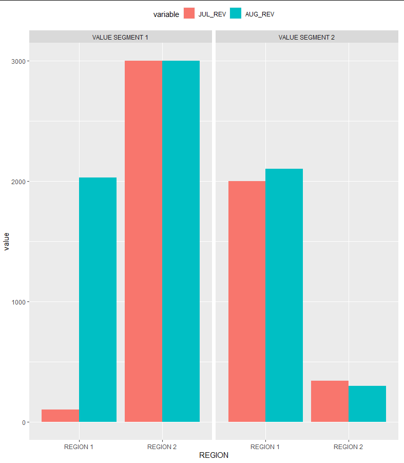
ggplot()+
  geom_bar(data=melt_df,aes(x=REGION, y=value, fill=variable), stat='identity')+
  facet_grid(~VALUE_SEGMENT)

I put the legends at the top. Let me know if you need any help!


