0
$\begingroup$

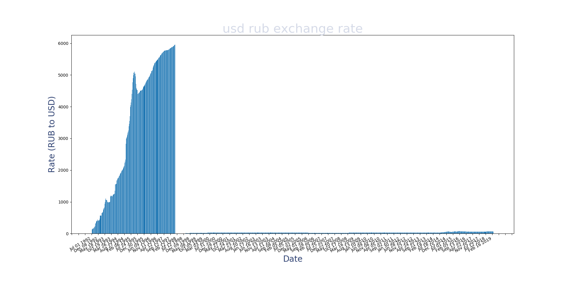
I'm graphing the value of the Ruble against the US Dollar in the 1990s. There was hyper-inflation from 1992-1997 (where the "y" values expanded from 125 to 6000). On Jan 1st 1998, the government revalued the money to 5. Since then the number has trended upward but has only reached 70 or so.

This creates a problem in my bar or line graph. You can't understand the low values after the stabilization. Any suggestions to help with this discrepancy when viewing the whole dataset in one graph?

Bar graph showing precipitous drop in values and therefore affecting the scale of the graph.

Plotting using matplotlib

$\endgroup$
3
  • $\begingroup$ Is it necessary to see the entire graph at once? Is it really meaningful to see comparisons between each side of the arbitrary revaluation? Does the data need to be directly, easily interpretable? $\endgroup$
    – Upper_Case
    Commented Apr 9, 2019 at 20:12
  • $\begingroup$ It would be nice. I've produced two individual graphs (before and after the revaluation). But if I wanted to view a graph like the image posted, could I view it in a different way, such as a Logarithmic scale? or to put an <...> in the y axis at some point to save space? Just wondering what others do in this situation. $\endgroup$ Commented Apr 9, 2019 at 20:20
  • 1
    $\begingroup$ I think you should use a log scale but if you are going to present this to someone, make sure you be emphatic about it! $\endgroup$ Commented Apr 9, 2019 at 20:55

1 Answer 1

1
$\begingroup$

A log scale will make the difference before and after revaluation look less extreme, and a log transformation is usually pretty defensible for things measured in units of currency (especially when there are no 0-value entries). Other transformations exist, but since this is mostly for aesthetics I don't think that you'd need much that a log transformation couldn't offer.

Fiddling with multiple vertical axes and continuity breaks may help, but at an almost-guaranteed cost of making the graph very difficult to view and interpret correctly. If you need to show both periods, I would probably log transform.

You will know your needs far better than I do, but I do question a little bit how valuable seeing the before and after this way is. The revaluation was an arbitrary decision introduced at an arbitrary time, and behavior of the currency before the revaluation is probably not very informative of anything that happened afterwards (and vice-versa). It's far from clear to me that there is much value in showing both at once like this, at least from my naïve look at a single graph.

The main reason I can think of to show both at once this way is to display how extreme the inflation was, in which case the scale differences would be a feature and not a bug.

$\endgroup$
1
  • $\begingroup$ thank you for your answer and advice. $\endgroup$ Commented Apr 11, 2019 at 13:52

Your Answer

By clicking “Post Your Answer”, you agree to our terms of service and acknowledge you have read our privacy policy.

Not the answer you're looking for? Browse other questions tagged or ask your own question.